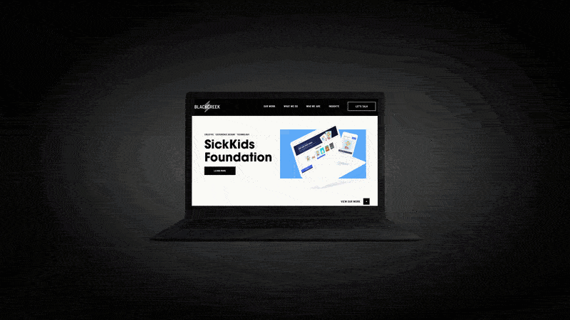
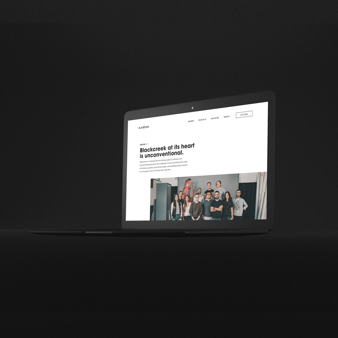
Blackcreek was a Toronto-based digital agency, focusing on website creation, branding, and product design. They specialized in health-care and pharmaceutical companies. As the Design Lead for Blackcreek, I created a new brand identity for the company as well as helping with the website's design and creation.
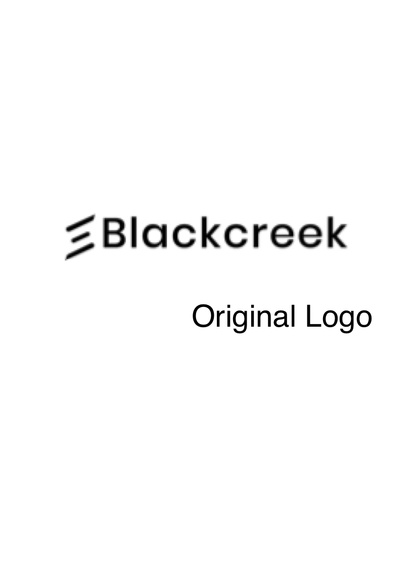
visit live site →The initial logo was a very plain three lines at an angle. While the owners were not married to it at all I liked the idea of it and played around with abstract designs and shapes to find something that would fit the brand.
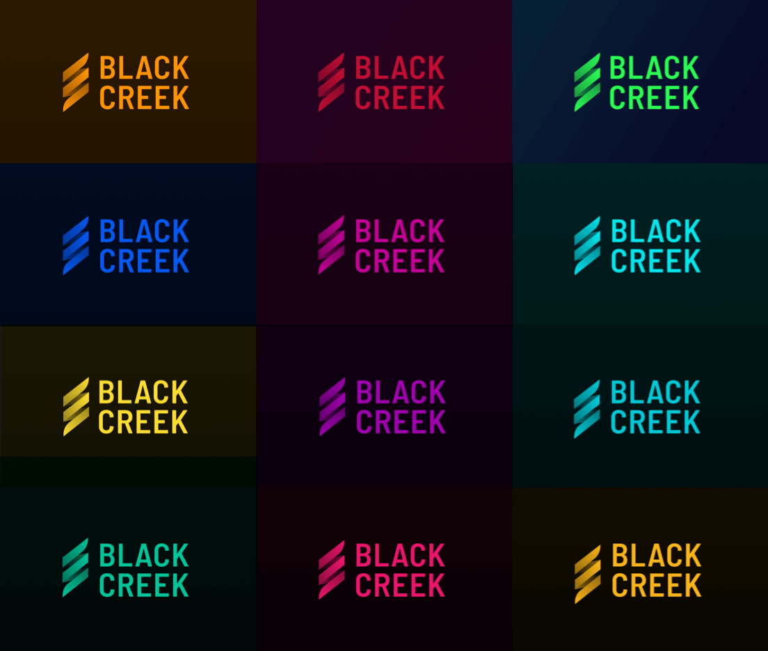
I knew that we wanted to keep it black and white as a base so that it could be easily applied on any colour. During the process I was challenge to provide the owners with a “safe” option, and an option that was completely against the grain and pushed all of our perceptions and boundaries of what we thought Blackcreek was.


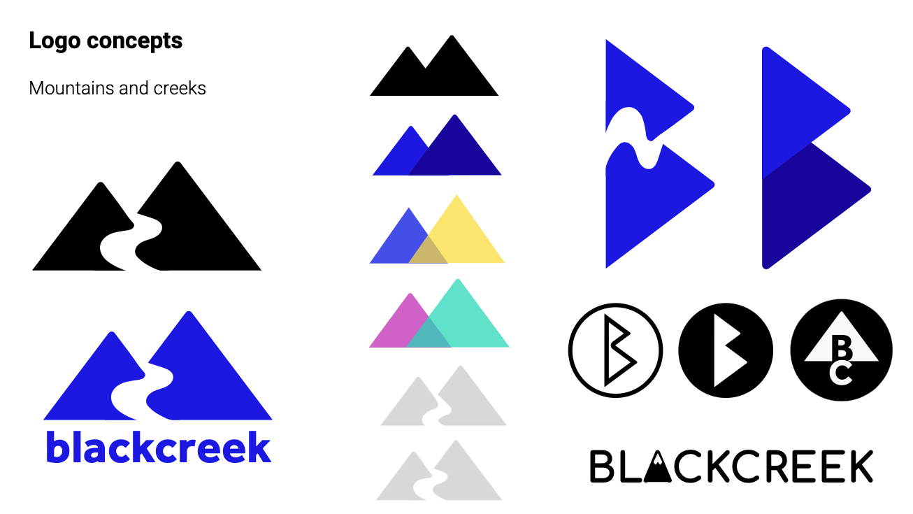
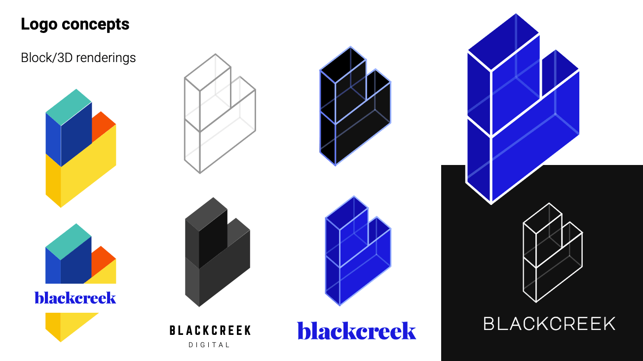
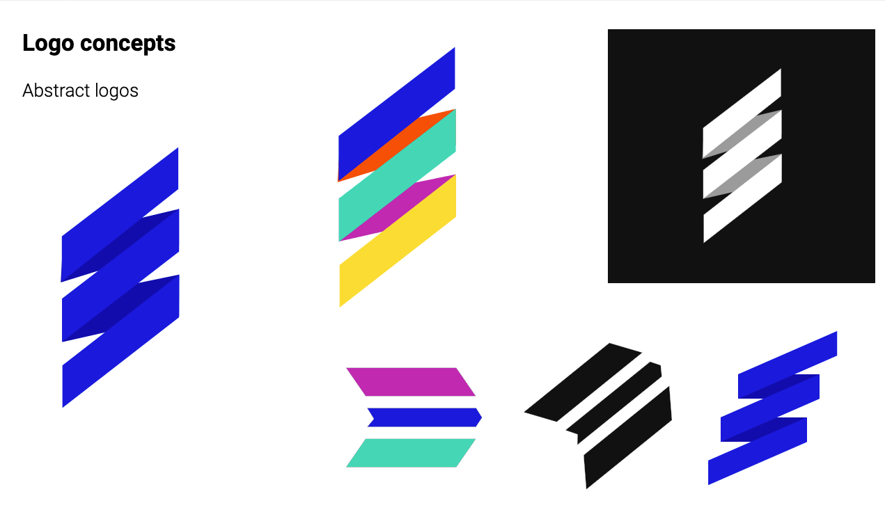
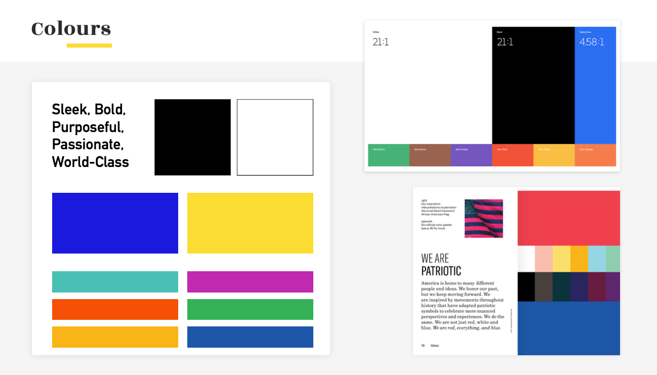
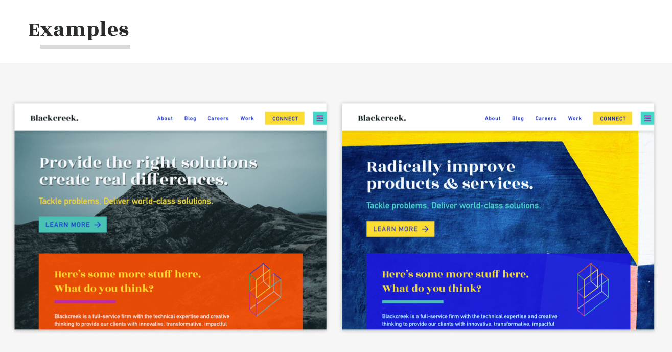
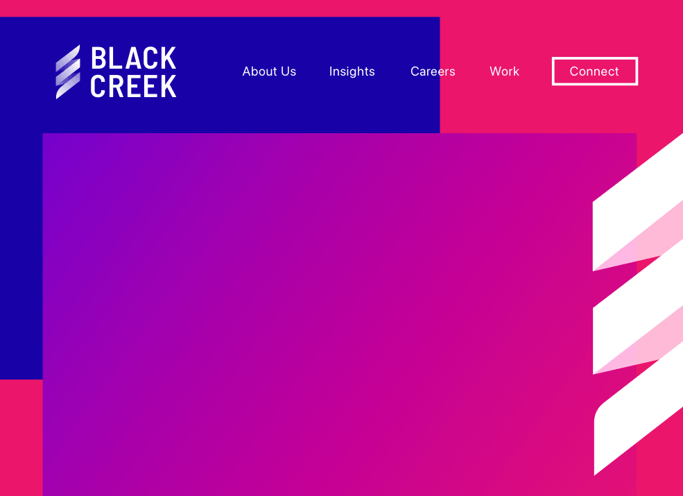
We ended up going with something in the middle; a sleek, simple logo that could be applied nearly anywhere and would never be the focal point, while allowing for a much more bold and colourful design palette in certain situations that called for it.
I created a brand guideline as well as creating two unique primary logos: one mainly for mobile, and one mainly or larger or more horizontal applications. The icon that I created is supposed to be a very abstract take on a DNA strand, also representing progress or starting from one point and going to the next which felt like our journey at the agency at that time.
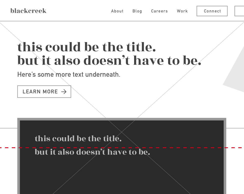
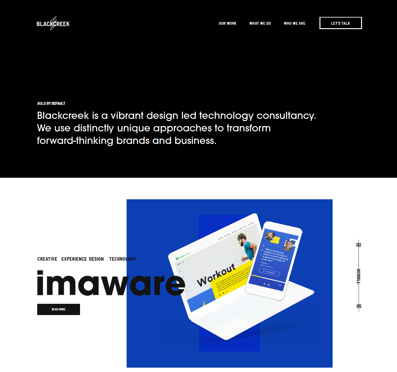
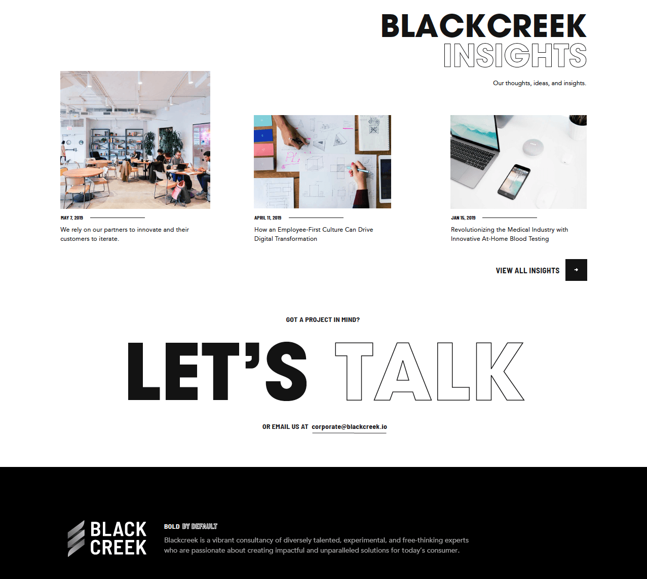
The website was created once the brand was finalized. This was mostly created in webflow and was my first experience with the software which I now use all the time. The design of the site was to be simple, with quick clean animations, a project-centric flow, and minimal text.


How simple is too simple? I was proud of the icon and it’s near infinite applications but I felt we never pushed the envelope enough with the overall brand and identity. I had worked with internal rebrands before but never something such as drastic as this. Creating this identity and working closely with both owners was a crucial learning point for me on how to properly present designs and how to have effective discovery sessions. In the discovery phase, being challenged to create pieces that were so against what I would normally design was a landmark moment for me in my career. In each of my projects I’ll do this excercise and see what the other side of my brain comes up with. Sometimes it confirms my own original path, and sometimes it allows me to create something completely new and unique and let’s me break out of my own style.
Unfortunately Blackcreek did not survive the pandemic and so we all went our separate ways. I'm still proud of this brand and site and a link to it exists thanks to the wayback machine!